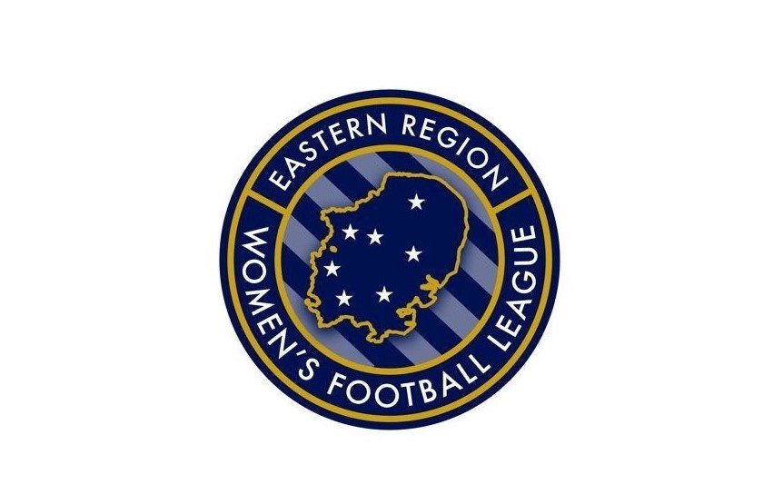
The Eastern Region Women’s Football League has unveiled its new branding, crest, and colours.
The ERWFL said in a press release:
We believe this is a positive step in the right direction as we continue to modernise our women’s league to be able to meet the needs of our clubs, players, and wider audience.
The Eastern Region Women’s Football League is currently the springboard to the FA Women’s National League, combining teams from 7 counties, the league currently sits at tiers 5 and 6 of the women’s football pyramid.
It was vital to the league that as we represent teams from across the different counties that each had their representation as a part of the logo, within the new logo we have included the region outline which is instantly recognisable to anyone from the East of England as well as communicating the size of our region.
The stars within the logo represent the volume of counties we represent within our league structure which are Cambridgeshire, Essex, Suffolk, Bedfordshire, Norfolk, Huntingdonshire, and Hertfordshire.
The diagonal stripes represent the forward movement and direction the league is constantly moving in to improve.
Finally the unified by pride slogan we believe typifies what we are trying to achieve as a league, with everyone working together to achieve the goals of improving the female game within our region, we believe when we continually manage to achieve these goals everyone collectively shares great pride.
The Eastern Region Women’s Football League are really excited by this movement and believe this alongside a change in our social media & marketing strategy will support the continuous improvement of our league, as we strive to improve the female game and the experience for all clubs, teams and participants within it.

