Football kits, love to hate them, hate to love them…
From France’s Nike pyjamas to Germany’s eye-catching wave, this summer’s World Cup is a feast for the eyes and that’s even with only one game of football underway writes SOPHIE LAWSON.
The tournament is almost entirely shared by Adidas and Nike with Le Coq Sportif (Cameroon), Puma (Italy), Umbro (Jamaica) and Warrix (Thailand) rounding out the 24. Nike are proving the headline act this summer, the company stepping up to create a range of kits specifically for the women’s teams – with a better fit – and a nod to the cultures and heritages of those who don the colours.

Group A: France – South Korea – Norway – Nigeria
If France wore anything other than a navy-blue home kit, there may well be riots; Nike’s basic blue with gold badge look for the hosts a little on the bland side for most. However, the away kit is where people have fallen in love as others have fallen into bed, the design a simple white shirt with polkadotted navy hexagons. The shirt combined with plain blue shorts might look like pyjamas to some but to everyone else, the shirt is magnifique.

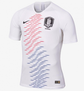
South Korea were possibly left feeling a little fromaged off when they took to the pitch in France (and not just because they faced a purring home nation), their Nike kits not specifically designed for them but rather just the same designs that were used for the men last summer. The home shirt is plain red, the away kit one that could pass for a US knock-off at a glance with blue and red [tiger-print inspired] slashes across the front. This is one we’d give a miss.
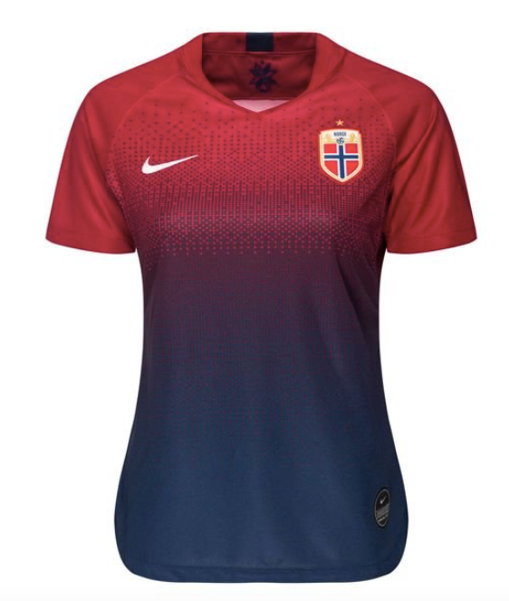
Although Norway’s away kit is the same from last year – a mostly white shirt with blue and red lines from the collar up – the home kit is an absolute beaut’ and arguably the best Nike produced this summer. We like a fade, don’t get aggy! The shorts are a plain blue but play an integral part when paired with the red and blue home shirt, the blue dissolving into red in an almost Christmas sweater (it’s actually a traditional Norwegian ski sweater) pattern around the bust. The look a damn fine one that has had us reaching for our wallets.
Dominating the group, Nike rounds out their Group A quartet with Nigeria’s kit from last summer. The green and white body with black and white sleeves an instant fan favourite last summer, that still divides opinion around She Kicks towers – alright, we’ve got the one person who isn’t a fan in the office – everyone else loves it and loves that the women will get to wear such an iconic kit. The away kit is a simple deep green and seems perfect for masking grass stains.

Group B: Germany – China – Spain – South Africa
The Germany home kit is… we might need a minute here. Ohhhh, it’s lush! Adidas have taken an old school kit and modernised it with incredible success, the pixilated waving flag that rolls across the chest is a masterstroke that pops off of the bright white cotton background. The away kit is the Tiro 19 template that’s been adopted by a few other teams, the Germans with a deep red colour scheme, the overall design a love/hate one for most and we’re actually quite a fan of the application.

Speaking of templates, hello China home kit, bye bye Nike, do better. Oh, hello China away kit, well done Nike. The Steel Roses will go from 0-60 in the blink of an eye when they suit up in their grey away shirts, the orange shirt accents and intricate white phoenix motif may well get lost in the stands by up close it’s an absolute winner.

In keeping with the throwbacks, Adidas have given a long, hard nod towards Spain’s 1994 kit with the red and navy home shirt La Roja will be wearing this summer. The horizontal blue pinstripe feeds from right to left culminating in three columns of rhombuses; we’re none too sure about this one. Spain’s away attire is the same as Germany’s the white and grey colour-scheme giving a completely different look from Germany and Sweden’s away shirts, for us, it’s simple but effective.

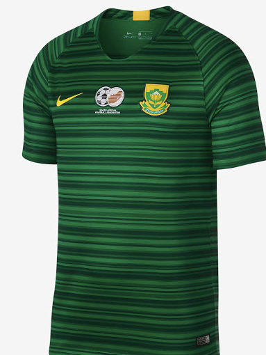
Like their African counterparts, Nigeria, South Africa will be wearing the same designs as the men from last year. The home shirt a bold yellow with horizontal green stripping on the sleeves, the away attire a deep green with darker green stripping all over. It’s not a bad kit but you’ve got to be up close and personal to really jive with it.
Group C: Australia – Italy – Brazil – Jamaica
Australia’s home kit might just be the vegemite of all kits ever; there is no middle ground, you either love this one or hate it. We’re reliably informed the shirt contains images of the Aussie landscape but for half of us it feels too much like starring at a Jackson Pollock, the inspiration taken from Melbourne street art and frankly, we’d rather it stayed in the spray can. The away shirt is a dark green with two simple, thin sashes that run diagonally across; Nike aren’t reinventing the wheel with it but it’s considerably calmer that their home fares.

It’s hard to hate a v-neck football shirt, it’s hard to argue that Italy should be in anything other than blue but it’s just so boringly blue… Puma’s offering for Italy’s away kit is somehow even plainer, the white shirts and shorts with blue accents not even deserving of a, “Prego” from us.

Like Italy, there’s only so much variance you can have with Brazil’s home shirt, the traditional gold and green not enough to win any awards but a sleek and fashionable shirt that we’d be lost without. Brazil’s away shirt where Nike have had some fun, the usual blue augmented with a constellation design to honour Brazilian warriors who looked to the skies for guidance. It’s nice, but we’d rather just look up at the night sky.

Although Jamaica’s home kit might look like a knock-off version of the Brazil shirt that you’d be likely to find down the market on a Saturday morning the away top is as individual as they come. The traditional Umbro diamonds make up the bottom half of the Reggae Girlz’ away shirt, the interlocked design a mix of green and yellow that provides a stark contrast to the plain black used for the top of the torso. It kind of looks like one of your granddad’s old jumpers, but it’s also a bit lovely.

Group D: England – Scotland – Argentina – Japan
England’s home kit is *checks notes* white. White shirts, white shorts, white socks. Yup. However, the Lionesses’ away look is one that divides a room faster than current British political discourse that we won’t get into now (sorry!) it’s a deep red with subtle designs that make our eyes go a little wonky. The body divided into four like a Battenberg or a tabard, the rose motif typically English, someone in our office can’t stop thinking about the Crusades when they look at it, someone else wants to take a photo of it and hang it on the wall.

Given some of the other kits Adidas have put out for this summer, we think Scotland have been left a little short-changed here. The home shirt is a traditional blue… that’s it, it’s a plain blue t-shirt with a round collar – so a downgrade from the gorge’ v-neck the team had been wearing this year already. The away kit falls back on the same Adidas template, the pink palette enough to make it look completely different to the others although it does also look like someone accidentally threw a strawberry Frubes into the washing with it.

The Argentina home shirt might just be the same one the men will be wearing for the Copa America this year but it’s a nice subtle design that offers something marginally different with a kit that can only change so much. The away kit another that we’ve seen before as it’s the same from last year, the dark body with blue and white cuts from the armpits towards the chest nice enough – and indeed a throwback to 1993 – but you could tell us it’s a training top and we’d be none the wiser.

Promised their own kits for the Women’s World Cup, Japan‘s fans were left to twiddle their thumbs waiting for the big reveal from Adidas. Some were reticent as the kit the men wore at the 2018 Men’s World Cup was an absolute pearler and at the eleventh hour, Adidas came through with the new kit. The good news is it’s 98% the same as the men’s kit, the white dotted lines made to look like samurai armour remain on the deep blue shirt, even the collar is the same shape. The main aesthetic difference is the fine detail on the v-neck (WE BLOODY LOVE A V-NECK) collar is an outer stripe of light pink. And very importantly, a star above the badge to denote Nadeshiko’s World Cup win in 2011.

Group E: Canada – Cameroon – New Zealand – Netherlands
When Nike announced they’d be providing bespoke kits for those going to the World Cup and that their designs would showcase the heritage of those nations Canada might have been eagerly awaiting what the sport’s company produced for them. Queue deflation. Both kits are monochromatic, the home apparel red, the away white… let’s be honest they’re boring as anything, plainer than water and… sorry, we fell asleep looking at them.

Having recently signed a new kit deal with Le Coq Sportif, we knew Cameroon‘s Indomitable Lionesses would not be wearing Puma’s rather bold number from last year but with time ticking down it didn’t seem like the kit would ever actually drop. But then, just before the start of the tournament, it did. Huzzah.

The good news for New Zealand is, if they forget to bring their home kits, they can just pop out and buy some plain white t-shirts and no one would be the wiser. Both home and away feature the eponymous Fern on the sleeve, the choice of silver something the contrasts the black away shirt and gives a much needed pop, the use of silver on the white shirt an exercise in redundancy.

When your team’s nickname is “Orange” there’s only one way you can go with your home kit. It also means that people who aren’t fans of neon coloured kits are never going to be clambering to buy them. The Netherlands‘ retro diamond design subtly opens into a tulip across the chest – another delicately done kit from Nike that will loose all of it’s character to those more than four yards away – but we do like it. The seafoam away shirt features an upwards pointing gradient that if copied onto an orange home kit would unquestionably make every player look like a salmon. The blue makes a nice change from the bright orange but it lacks a certain gravitas.

Group F: USA – Thailand – Chile – Sweden
The USA’s home kit is white. We’re not going to beat around the bush, it’s the same as England’s, the only difference the minimal accents, you guessed it, red and blue instead of the red and black used by the Lionesses. Nike don’t even get an F for effort. The USA away kit, again quite the contrast, again uses a red pallet and again has a bit of a weird texture woven into the pattern. A long way from the English rose, the USWNT’s away shirt looks like a Jasper Johns screen print, the all too recognisable American flag folded over itself to give a striking look of the stars and stripes.

As kit manufacturers go, Warrix is likely not one most are familiar with but we’re not entirely sold on what the Thai company has put out for the Thailand team. The home shirt a v-neck (good) plain blue (not so good) offering, the away shirt a red and navy horizontal stripe affair that looks more like a charity shop jumper than football kit.

The Chile home shirt is the same tired Nike 2018 template we’ve seen far too often around the world, it’s red, the accents are blue and the sleeves have that weird electric thing going on; yawn. The away shirt is mostly white with gradiated blue and red stripes, it’s the not the worst kit out there but it’s not the most inspiring either, we could take it or very much leave it.

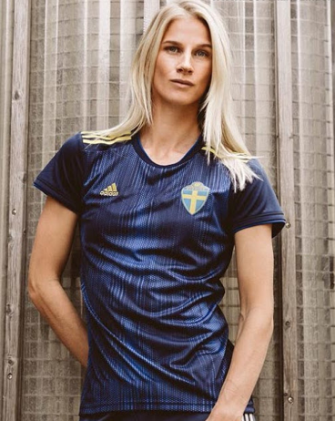
Sweden round out the 24 as Adidas makes another appearance with yet another throwback and back to 1994 we go. Some people really like this one, some people really don’t… and we’re in the latter category. Maybe the biggest issue is the kit it’s nostalgically brought back was a bit of a one to forget, Adidas’ penchant for the thin horizontal lines don’t really enhance what wasn’t great to begin with. The intended look falls flat and it ends up looking like backpack straps. The away kit the last to use the Tiro 19 template and again, because the colours used (dark blue and lighter blue) are so different to every other offering, it remains a distinct look from say Spain and we’d rather wear it than Sweden’s home shirt. Here’s Sofia Jakobsson looking sort of sultry in it.
What do you think?
Drop us a line at @SheKicksdotnet and @lawson_sv