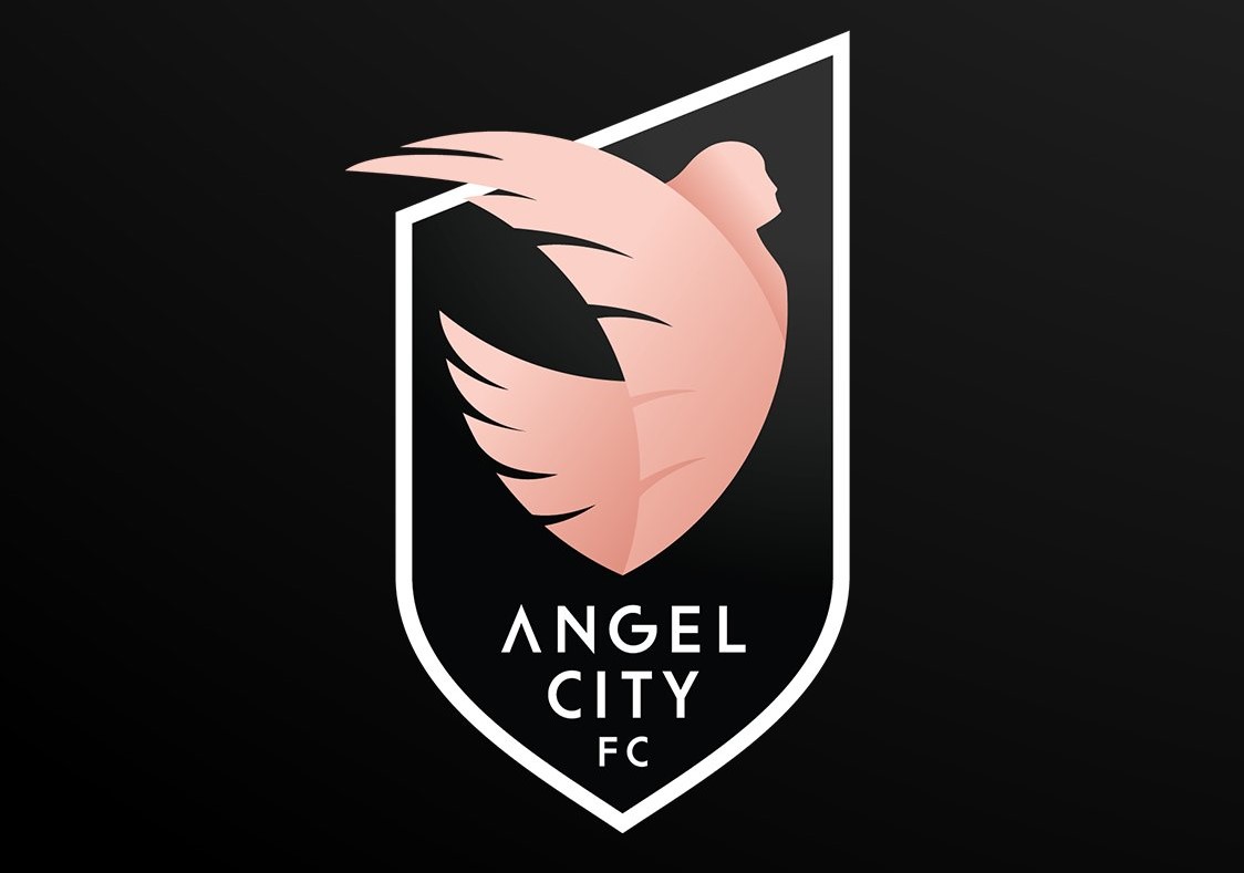
Los Angeles’ pro women’s soccer team, Angel City reveal crest and colours ahead of entry into 2022 National Women’s Soccer League.
The timeless crest is a visual representation of the club’s bold vision of rewriting the playbook for sports teams everywhere and making an impact on and off the pitch. The crest is inspired by the team’s home city of Los Angeles, the iconic colours of LA’s sunsets, and the idea that all Angelenos are bound together from the concrete to the coast.
The angel, the core element of the crest, signifies Angel City’s mission of being a positive light in the soccer world, its communities in Los Angeles, and beyond. Unlike most crests in soccer, the angel in the centre takes flight, breaking free from the boundaries of the shield, symbolizing ACFC’s commitment to challenging the status quo and breaking the mold of traditional sports clubs.
The angel is unabashedly flying towards the sun with wings inspired by Southern California’s fiercest bird of prey, the Red-tailed Hawk, and the city’s trademark palm trees. The 12 feathers of her plume reflect the togetherness required to succeed in soccer, with 11 representing the players on the field and the 12th representing the “12th individual,” which in soccer terms represents all the staff and supporters, uniting as one team, on and off the field.
Julie Uhrman, Founder and President of ACFC, said: “In this great city known for its endless sunsets and legendary stars, our visual identity had to pay homage to these important Los Angeles symbols, yet also signal what Angel City stands for ‒ a more equitable future for all.”
Kayla Green, Head of Marketing for ACFC, said: “We stand on the shoulders of giants, forging a path of change, impact and excellence. Our brand identity and crest are representative of everything we believe in. They are a visual reminder to the world that we must never stop challenging the status quo in our unwavering pursuit of equity.”
ACFC unveiled the crest online via a 10-minute “Brand Launch Show” on YouTube, hosted by international sports broadcaster Kate Abdo, featuring an anthem video shot with staff and supporters that revealed the colours and crest, content from the team’s former USWNT stars, and fan reactions.
The launch is supported by an advertising and marketing campaign across LA including out-of-home, fully wrapped Metro trains that travel to the team’s home pitch, Banc of California Stadium.
The crest was created by Amedea Tassinari, who also contributed to the LA2028 Olympic and Paralympic Bid as a designer.


